So, my stash is well bundled now. The ‘new’ yarns for projects continue in waiting and the scraps, which I prefer to call remnants, are bundled according to weight. I can easily pull out the same-weight remnants and mix and match to my heart’s content. This also helps me to get my creative juices flowing as somehow when I pair colors together, ideas come forth. The project that this post is about has come into existence in exactly this manner.
When I purchase yarn for a project I always purchase at least one extra skein. Many times I cut into that skein as my gauge rarely matches the gauge of the knitter who actually knitted the garment photographed in print. If there is little yardage on a particular skein, I have been known to purchase more than one extra skein. If the yarn is on sale, I have been known to buy out a particular color. In doing this, that means there is typically extra yarn after a project has been knitted. I LIKE that as then, without further yarn purchase, I can go and “play” with these remnants.
I chose to dabble with the remnants of the bulky weights that are in my stash. By holding colors together, these three surfaced as cohesive in my eye. They remind me very much of colors of a sunrise or sunset that we, hubby and I often see and appreciate. The yarn came from these three projects:
Fair-isle collared jacket (The collar was knitted from fingering weight remnants.)
Elephant Cardigan Each of the project links will take you to the patterns.
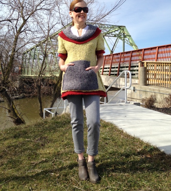
The red is Zealana Artisan Tui, the yellow is a Debbie Bliss chunky luxury, and the deeper blue gray color of the elephant cardigan is Rowan’s Colourspun. Now, to add to the mix of deciding fibers, weight and content, there is always the possibility of going into another weight of yarn and holding it double. When the Colorspun is held double, it worked perfectly as a bulky weight and was just the right shade for that sunrise/sunset appeal. Many trials, a bunch of swatches, and research of a pattern that would be exciting to me, (fashion forward, unique, and wearable with my current lifestyle AND mix and match with existing wardrobe), I finally came to this. Perfect, I thought. With an understanding of construction, planning ahead,
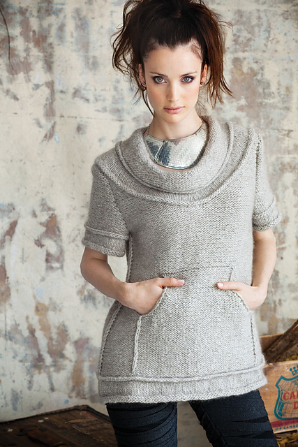
I knew I had enough of each remnant to pull this off. The pattern above is actually knitted in Zealana’s Tui.
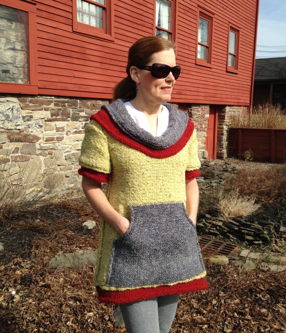
Mari Lynn Patrick is the designer of this fabulous Topper, pattern can be found in Vogue Knitting Fall 2011. I am such a fan of Mari Lynn and have knitted many of her designs. (At the bottom of this post is a gallery of my work with her patterns.) This pattern has quite the unique construction and sports an inside-out appeal. The wrong side of the knit is face up, side seams are sewn with mattress stitch on the inside leaving the seam exposed on the outside. Rolled hems on all edges, hem, sleeve, and neckline add interesting details, as well.
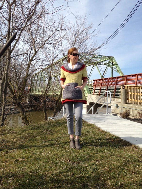
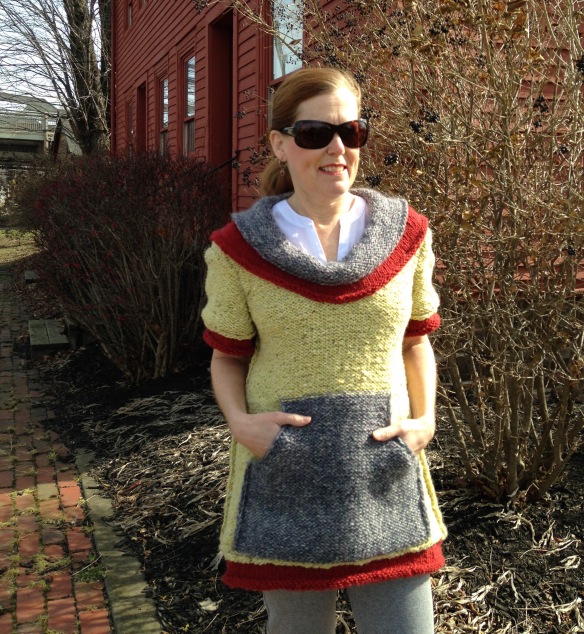
I especially like that the grey is around my neck and at the pockets as it is amazingly soft and scrumptious. Plus, I am reminded of the effort (and love) that went into the elephant cardigan for my husband.
We waited for a sunny day to show off the beauty of the yellow. And, the temperature was perfect for this outfit. Can’t you just imagine the sun setting in the background in these beautiful colors?
Here are other Mari Lynn Patrick designs that I have worked up in recent years. Putting together a collection from one designer, a knitter can see details that perhaps were inspirational in choosing that particular pattern. Perhaps a designer can capture his/her imagination and collect elements that are thought-provoking and possible to create in another original way. As the owner of this existing hand knit collection, the color palate rings of similarity. I had not realized that. Am I drawn to these particular shades? It leaves me pondering and isn’t that what creativity is all about?




Pingback: Dart Detail, Perhaps? | hollyknits
This is such a beautiful, colorfu project! I’m known to be keen on color myself, so, if I may say so, I like your version of the pattern so much more than the monochromatic sweater featured in Vogue! Great pattern of course, great color combination, too!
LikeLike
Thank you kindly, Mariazil. When I went looking for something for these bulky weights and found this pattern, I thought to myself why I hadn’t remembered it. And, maybe it is because it didn’t speak to me in the one color it is shown in the magazine. So, I agree with you about the color.
LikeLiked by 1 person
I never would have dreamt of putting those colors together in that pattern, and yet it is wonderful! Not only a talented knitter, but what an eye for color and form you have. :-)
LikeLike
That is a very kind comment, Sarah. Thank you and I must say I am very pleased with the outcome.
LikeLiked by 1 person
A stunning use of remnants ! I like the exposed seams look, looks more edgy and modern. Another great knit for your wardrobe.
LikeLike
ooohh, I love your comment. Thank you, Agnes! I’ll be wearing this at our next Guild meeting!
LikeLiked by 1 person
That’s such a good idea to match up and store your yarn that way. The results are lovely. It really suits you!
LikeLike
Thank you. I think Mari Lynn’s patterns are outstandingly interesting. You know, it’s taken a lot of thought to get these yarns organized and in a way of easy access as well as ease of creativity and stored in the least amount of space. Yikes! Damn good thing I don’t love cars! ha
LikeLiked by 1 person